flashbak.com
The Many Pulpy Delights of Gold Key’s Star Trek Comics
Star Trek ran for only seventy-nine episodes before the show was cancelled in 1969. Two years. It might have gone the way of mid-60s two-season shows that hit high marks with critics then faded away. (Ever heard of CBS sitcom ‘The Governor and J.J.’? It won Julie Sommars a Golden Globe.) There are as many explanations for its eventual success as there are new versions of Star Trek.
I would not venture to chart exactly how an often campy, expensive sci-fi show with middling ratings, diverse casting, and surprisingly progressive politics even managed to even get a second season in the mid-1960s, much less launch a franchise—a ‘universe’, as they say—that continues to expand and get cancelled, in perpetuity. Histories abound from cast and crew and fans alike. To even approach the issue, however, one must keep two important things in mind.
The original series (TOS, officially), gets remembered as fantasy wish-fulfilment for nerds, a characterization cemented in the minds of Black Mirror fans by a pair of season-spanning episodes. But Star Trek was mainstream prime-time prestige television for its time, running against proven hits Bewitched and My Three Sons. The show secured five Emmy nominations (one for Outstanding Drama Series) in its first year.
In renewing the show for a second season, ‘NBC may have hoped the publicity’ surrounding its critical recognition ‘would have translated into increased viewership’, notes Michael Kmet at Star Trek Fact Check. (Spoiler: it didn’t.)
The second thing we forget about the time of TOS is that it launched a merchandising juggernaut nearly on par with Beatlemania, anticipating manic toy-store tie-ins of 80s children’s cartoons, although with a slightly more literary bent (the first tie-in Star Trek novel debuted in the same year as the show). There were cereal box tie-ins (send away for six free masks from Kellogg’s Corn Flakes) and bizarre toys that made no sense.
Before the show itself became a cartoon in 1973, it was a licensed comic book. Not the 18-issue Marvel Star Trek series of repute, but a long-running series of stories produced by Western Publishing imprint Gold Key comics, an outfit that made comics for other TV programs (even ‘The Governor and J.J’ got one) and had its own stable of heroes from the far-flung future and prehistoric past (such as ‘Magnus, Robot Fighter’, and ‘Turok, Son of Stone’).
Gold Key Star Trek comics came out in the series’ first year, 1967, and ran until 1979, when Marvel acquired the license from Paramount (and could only use characters and concepts from the first Star Trek movie). There’s a case to be made for these comics as a key driver of the show’s grassroots popularity, ratings-be-damned. The series outlasted the original show by over a decade. ‘Stories by Dick Wood, John David Warner, George Kashdan, Len Wien and others were all, as I recall, mostly solid,” comics writer Paul Kupperberg opines.
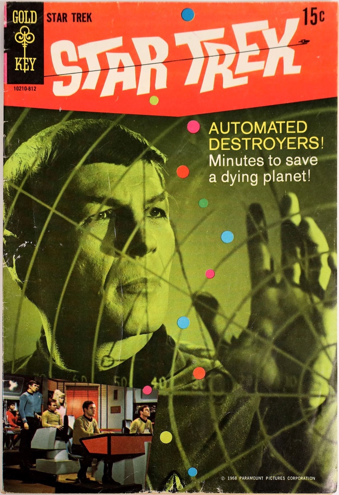
Those many solid stories would count for little if the Gold Key art were not fantastic, pulpy fun of the best sort. That starts with brilliantly-designed covers which, at least in the first few years of the series, mixed photography from the show with art and design that seems to bring together the aesthetics of Blue Note album covers with a more lurid, giallo art style. The strange mix derives from the fact that the comic’s first illustrators, Italian comic artists Nevio Zeccara and Alberto Giolitti, hadn’t seen the show.
‘Sure, we’d get scenes with the Enterprise looking as if it had exhaust fumes coming out of the nacelles and secondary hull, giant pink tricorders, and phasers that looked more like they belonged in the company’s Flash Gordon book. Also, the artists seemed to have a problem properly drawing Uhura and Chapel. Chekov was hardly in this series and, when he was, he wasn’t very memorable.’
—Warp Factor Trek
Spock often features as the cover star, reflecting the way Leonard Nimoy’s character broke out and became a major star of the show, to the dismay of network executives, who thought his pointy ears made him look Satanic. (Gene Roddenberry recalls NBC telling him after a fight, ‘fine, leave him in, but keep him in the background, will you?’.)
It didn’t seem to matter tremendously to readers of the comics that the art inside suggested a different universe than the one appearing on TV each week for two years. And after the series ended, the writers and artists could take the plots anywhere they wanted, although ‘later stories did their best to capture the continuity and feel of Star Trek,’ superfan Bob Vosseler notes.
Those comic writers had to answer to the world’s most obsessive fan community after all. When it came to the art of the Gold Key Star Trek comics, however, dramatic license was and could be taken, to the delight of at least one fan: ‘I always kind of wished the guys who drew the Star Trek comic had designed the TV show as well’, Kupperberg writes. ‘The interiors of the Enterprise were way more elegantly futuristic than the squared-off plywood boxes of the show, and they dressed members of landing parties in cool jumpsuits.’ Indeed. See more classic Gold Key covers just below.
The post The Many Pulpy Delights of Gold Key’s Star Trek Comics appeared first on Flashbak.








 New Posts (Home)
 ChatBox
 Popular Posts
  Game Zone
 Top PodCasts