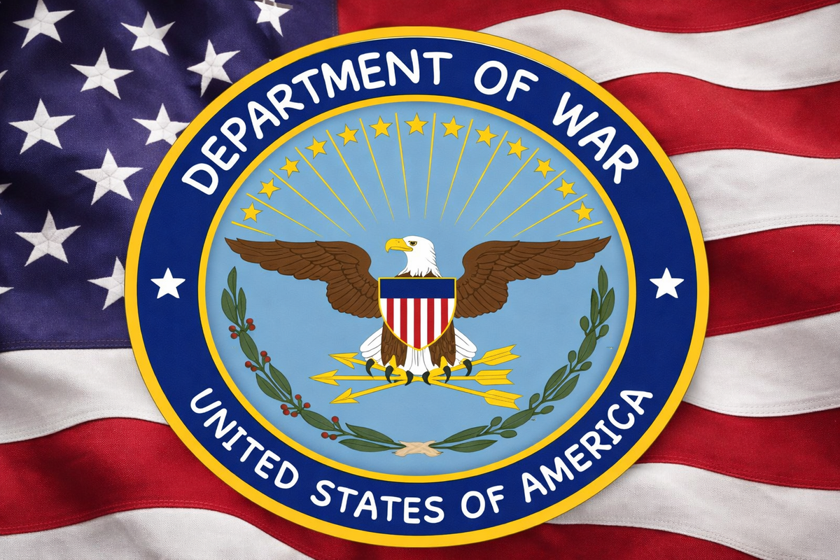
WASHINGTON — Following the U.S. State Department’s recent switch from Calibri to Times New Roman, the Pentagon announced it would also be updating its typography standards. The update was delivered via an official photo posted on X, showing Secretary of Defense Pete Hegseth unveiling the new policy on Department of War letterhead.
The letter read:
Hey warriors, losers, and ladies,The Department of Defense used some lame, gay font, but we are not the Department of Defense anymore. We are the Department of WAR!!!!!!!!!!
By my direction as Secretary of WAR, we will now only be using Comic Sans.
Hegseth went on to explain that Comic Sans is “more clear and easier to read,” but clarified that the readability was “not in a woke way.”
“It’s tough. And cool,” the memo continued. “It is a way better font than Calibri. Oswald looks okay, I guess. But it makes me think of Lee Harvey Oswald. Jury’s still out on that guy.”
The letter made clear that Arial is now strictly prohibited, describing it as “UNACCEPTABLE!!”
“Never again will the Department of WAR lower itself to a gross, dumb font that looks fragile,” Hegseth wrote. “Comic Sans is the best font. Courier New is also pretty neat because it looks like a typewriter, which is basically a gun for words.”